Data Analysis and Visualization (Bonus)
Overview
Teaching: 20 min
Exercises: 10 minQuestions
How can I use Python/pandas to analyze data gathered from/about my media collection?
How can I use data visualization tools like matplotlib or seaborn to present my analysis in a clear and digestible way?
Objectives
Use pandas to analyze MediaInfo metadata
Use matplotib to visualize data analysis
What’s Next? Data Analysis and Visualization
Alice is happy with the fruits of her efforts–she’s gathered technical metadata from every file contained on her hard drives, she’s made copies of existing MP4s, she’s created new MP4s, she’s losslessly transcoded her uncompressed Quicktime master files, and she’s found ways to skip over those files (DV-encoded) that wouldn’t benefit from this kind of transformation.
But Alice has realized that while doing the work is one thing, being able to analyze the data surrounding her efforts, and being able to communicate that information upstream to senior management at New Amsterdam, is perhaps as important as creating smart, automated workflows to begin with.
pandas: the Google Sheets/Excel replacement you didn’t know you were missing
pandas is yet another python add-on, this time an extraordinarily powerful data analysis engine that comes from the world of finance, specifically quantitive analytics. While it may seem intimidating, pandas is remarkably user friendly and intuitive. pandas is excellent at:
- normalizing data from diverse sources
- performing calculations on rows or columns
- concatenating or joining or grouping by category
- visualization
And pandas is really excellent at: reading/writing to a range of metadata formats, including Excel, CSV, JSON, and more!
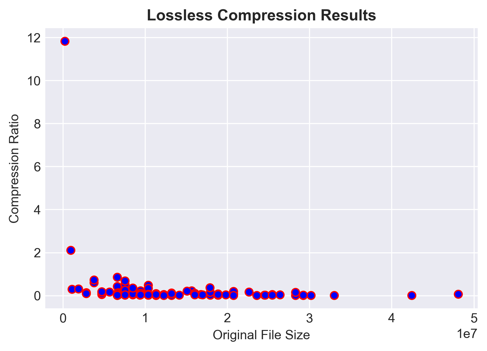
Alice’s new adventure: creating a scatterplot of compression ratios
After learning to work with FFmpeg, and testing the integrity and losslessness of FFV1, Alice is finally ready to present her findings to administrators and make a compelling case for transitioning the Library to lossless encodings for all audio, video, and film digitization. Alice can demonstrate checksum comparisons, and she can speak anecdotally about file size savings and ease-of-use, but she has a sense that overarching numbers and, even better, visualizations in the form of charts and graphs, might be more convincing to her supervisors who are too busy for the nitty-gritty.
Why a scatterplot? Why not? The combination of pandas and matplotlib can generate nearly any form of visualization–including pie charts, bar charts, heat maps, line graphs, histograms–but there is something unique to scatterplots that can highlight the variance inherent in FFV1 compression. Bottom line: FFV1 is smart and adaptive, and not all video content compresses in exactly the same way, to the exact same degree. With a scatterplot, we can visualize these differences, and possibly learn how to better predict compression ratios in the future.
Another set of FFV1/MKV, but this time with a mistaken twist
Let’s begin by transcoding another set of FFV1/MKV files from our Quicktime masters, but, to make things more interesting, let’s assume that Alice accidentally forgot to include an if statement that separated out her DV-encoded Quicktime files.
mov_list = [ ]

for root, dirs, files in os.walk(video_dir):
    for file in files:
        if file.endswith('.mov'):
            file_path = os.path.join(root, file)
            mov_list.append(file_path)
And let’s make a new landing pad for our new MKVs:
new_mkv_folder = os.path.join('Desktop/pyforav/new_mkvs')
if not os.path.exists(new_mkv_folder):
	os.makedirs(new_mkv_folder)
And let’s transcode our set, this time not paying attention to underlying codecs (DV might get bigger, not smaller!):
for item in mov_list:
        output_file = os.path.join(new_mkv_folder, os.path.basename(item).replace('mov', 'mkv'))
        subprocess.call(['ffmpeg', '-i', item, '-map', '0', '-dn', '-c:v', 'ffv1', '-level', '3', '-g', '1', '-slicecrc', '1', '-slices', '16', '-c:a', 'copy', output_file])
For reference, to identify our DV-encoded Quicktime files, we could easily use a series of nested for loops and if statements:
for item in mov_list:
    media_info = MediaInfo.parse(item)
    for track in media_info.tracks:
        if track.track_type == "Video":
            if track.format == "DV":
                print(item)
Checking our work
If we wanted to see if we had an equal count of MOVs and MKVs, how would we do so?
Solution
len(mov_list) returns 102
len(new_mkv_folder) returns 23
What gives?
The len of mov_list counts the list of full file paths that we created for the MOVs.
The len of new_mkv_folder returns the number of characters in the relative path ‘Desktop/pyforav/new_mkvs’
Annoying, to be sure, but to get the results we’re after, we’ll need to take another os.walk around the block.
mkv_list = [ ]

for root, dirs, files in os.walk(new_mkv_folder):
   for file in files:
      if file.endswith('.mkv'):
           file_path = os.path.join(root, file)
           mkv_list.append(file_path)

len(mkv_list)
102
The DataFrame–the core data structure of pandas
Before we make some cool looking charts, we’ve first gotta gather up the information that we’re hoping visualize. To do this, we’re going to pull some MediaInfo and feed it into a “dataframe,” essentially a spreadsheet written into python/pandas memory. The precise definition of a DataFrame (from geeksforgeeks.com) is “a two-dimensional, size-mutable, potentially heterogenous tabular data structure with labeled axes (rows and columns).” It might make you shudder, but again, just think of it as a nifty spreadsheet.
Step 1: gather up file names and file sizes from our original set of Quicktime files.
all_file_data = []

for item in mov_list:
    media_info = MediaInfo.parse(item)
    for track in media_info.tracks:
        if track.track_type == "General":
            general_data = [
                track.file_name,
                track.file_size]
    all_file_data.append(general_data)
Step 2: feed that information into a dataframe, naming the columns.
import pandas as pd
df = pd.DataFrame(all_file_data, columns = ['filename' , 'origsize'])
df
	filename	origsize
0	napl0154	10373547
1	napl0202	12261877
2	napl0259	8489273
3	napl0408	6603097
4	napl0497	11313821
...	...	...
97	stantonrequest_0162	7544373
98	stantonrequest_0196	6597103
99	stantonrequest_0284	9426295
100	stantonrequest_1407	7543563
101	stantonrequest_1882	10366815
102 rows × 2 columns
Step 3: gather the file sizes of the MKVs, and add them to the dataframe by simply declaring the list as a new column.
mkv_sizes = []
for item in mkv_list:
    media_info = MediaInfo.parse(item)
    for track in media_info.tracks:
        if track.track_type == "General":
            mkv_sizes.append(track.file_size)


df['new_size'] = mkv_sizes

df
filename	      origsize	    new_size
0	napl0154	10373547	4941973
1	napl0202	12261877	385272
2	napl0259	8489273   	325594
3	napl0408	6603097   	2803794
4	napl0497	11313821	179603
...	...	...	..
102 rows × 3 columns
By default, pandas only displays a select number of rows; to get a full and complete output, you can make an adjustment:
pd.set_option('display.max_rows', 1000)
matplotlib and data visualization
Let’s take our dataframe and transform it into something both visually appealing and communicative. To make this happen, we’ll call upon matplotlib, a 2D plotting library which offers a host of amazing features and customizability.
First we’ll import matplotlib and ask Jupyter to display visualizations directly in our notebook.
import matplotlib.pyplot as plt
%matplotlib inline
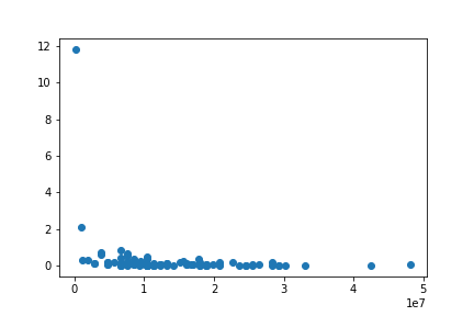
Next, we’ll create our first scatterplot, using the original size as our starting point and the ratio between the new and original sizes as our point of comparison.
plt.scatter(df['origsize'], (df['new_size'] / df['origsize']))
From here, we can create an image with a bit more pizzazz by adding a title, labels to the X- and Y-axes, color-coding our scatter dots, and incorporating a special Seaborn “darkgrid” style.
plt.style.use('seaborn-darkgrid')
plt.title("Lossless Compression Results", fontsize=12, fontweight='bold')
plt.ylabel('Compression Ratio')
plt.xlabel('Original File Size')
plt.scatter(df['origsize'], (df['new_size'] / df['origsize']), edgecolors='r', c='blue')
And finally, if we want to save our image for future use, we can save our figure to the location of our choosing:
plt.style.use('seaborn-darkgrid')
plt.title("Lossless Compression Results", fontsize=12, fontweight='bold')
plt.ylabel('Compression Ratio')
plt.xlabel('Original File Size')
plt.scatter(df['origsize'], (df['new_size'] / df['origsize']), edgecolors='r', c='blue')
plt.savefig('/Users/username/Desktop/scatter.png', dpi=300, bbox_inches='tight')
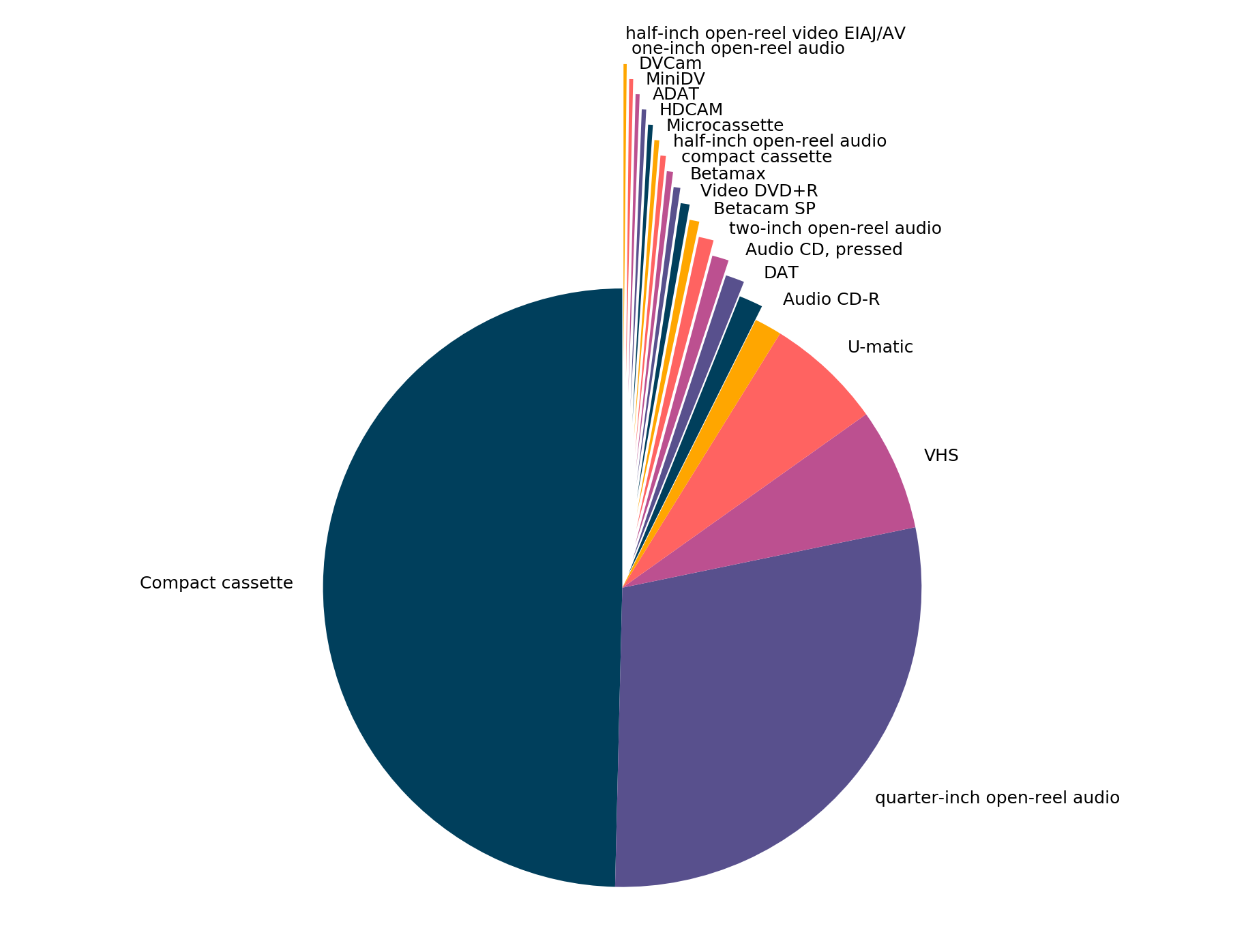
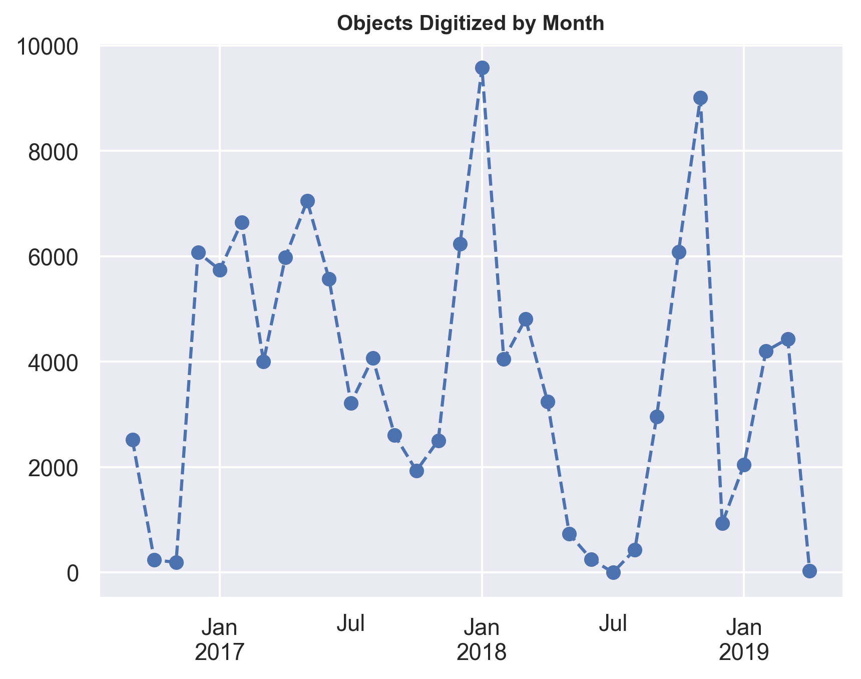
If the scatterplot is feeling a little “what is happening here?” to you, know that pandas and matplotlib can be used in more straightforward applications.
Here, for example, is a breakdown of objects digitized by format:
And here’s a line graph of objects digitized per month:
Key Points
Automate your CSV/Excel
Analyze data as you go